

PETITE AVE
My Role
UX Designer
My Tools
Sketch App | Google Analytics
Problem: Users are not compelled by the petiteave.com homepage and are not inclined to shop or create an account.
Opportunity: The scope for improvement and investment is significant.
Petiteave.com currently attracts approximately 44.1% direct search, 29.4% social, and 24.7% organic search visitors per month.
9.2% of original visitors to the homepage make it to the second page of products, and only 5.7% make it to the 3rd page of products.
The conversion rate during the examined time frame was 0%.
Solution: I redesigned the petitveave.com homepage by emphasizing its value proposition in order to attract target users, to improve customer experience, and ultimately to increase user conversions.

Initial Analytics Finding: 36.7% of visitors landing on the homepage drop off immediately. Approximately 61.7% of those who move on to petiteave.com/products page drop off from there.
Competitive Analysis

Strategy
I researched 10 competitors and focused on common site display standards that compose the theme or overall story to distill commonalities and find industry best design practices.
Findings
I analyzed the findings, calculating what percentage of sites followed each of 10 homepage style standards.
I then used these numbers to organize style conventions by importance, finding examples of what not to do, identifying the existing standard, and highlighting the potential to be better for each.
Research Findings and Thought Processes
Wireframes implemented takeaways from both market and user research:
Users wanted more visuals, more excitement, and less 'wordiness'
Competitor sites had clothes organized by categories right away, trending items, and many differing CTAs
The business owner wanted to highlight the brands and ensure appropriate messaging around body shapes - hence the infographic and language.
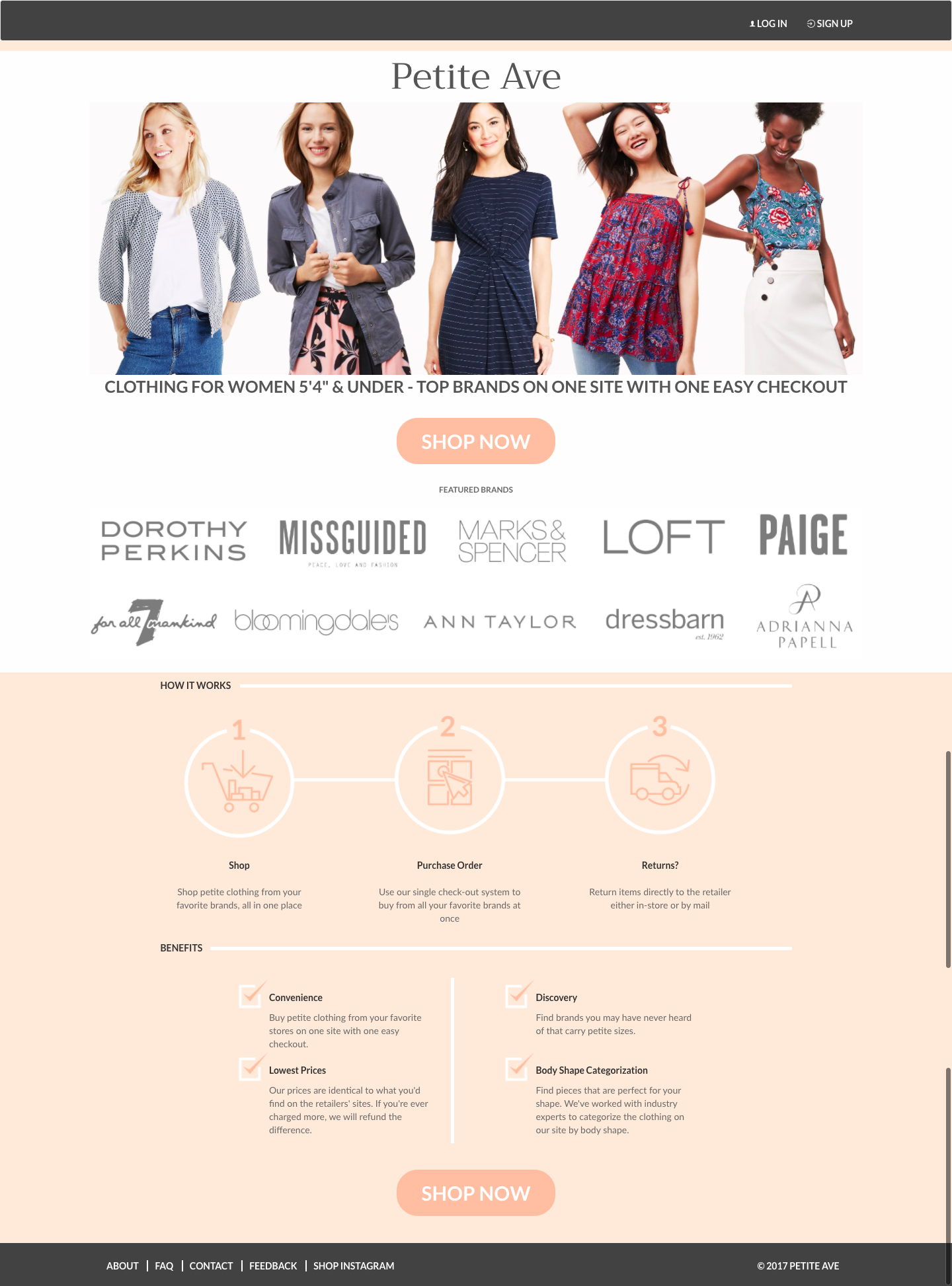
Homepage Mockup
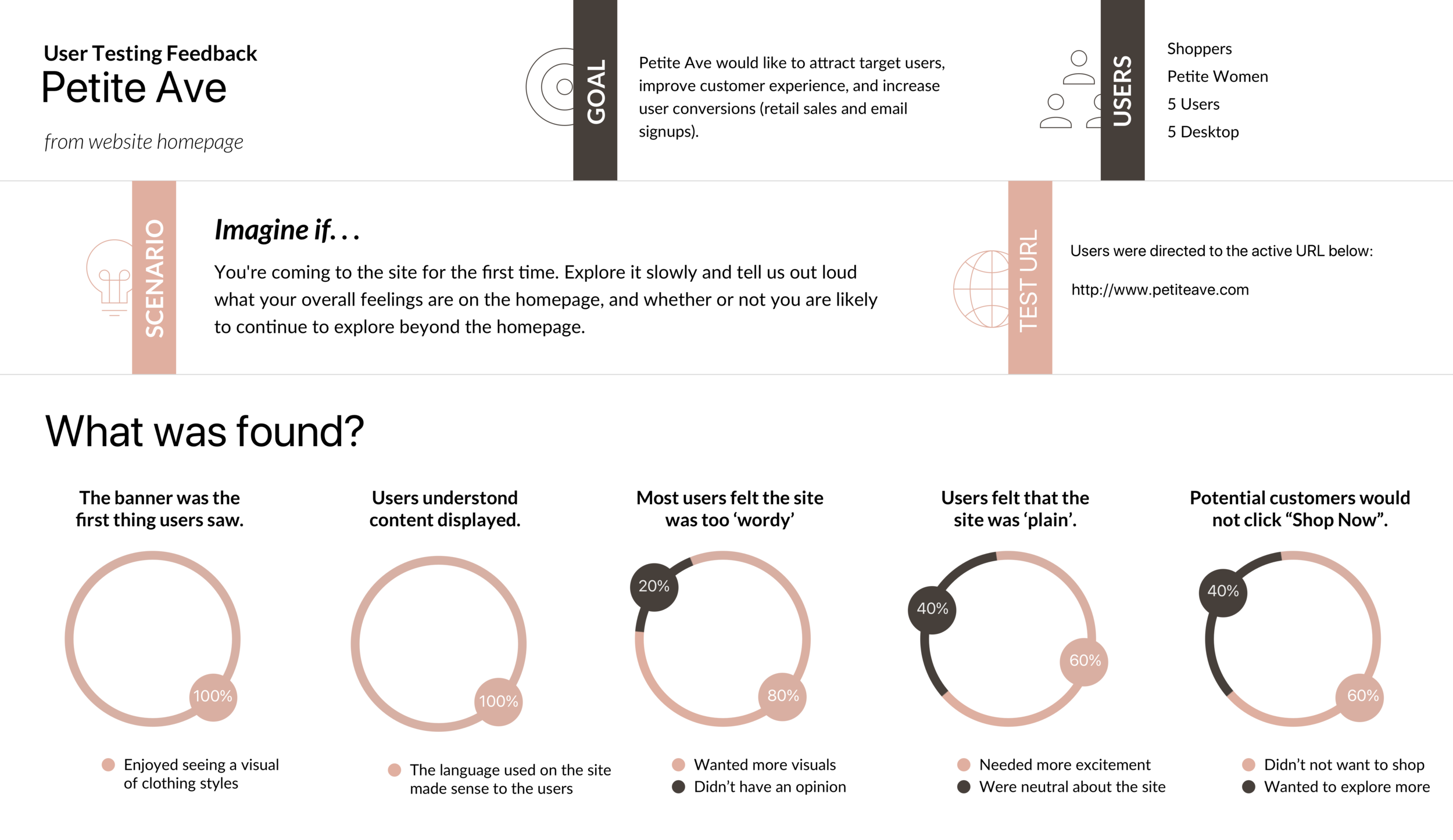
Result & Client Feedback
The conversion rate for the site increased by an order of magnitude just by aligning user expectations with the UI and reworking the content hierarchy. The client was pleased, and provided the following feedback:
"Julie is by far one of the most organized, thorough, and insightful UX consultants that I've had the pleasure of working with. She did deep dives into my website analytics, user base and competition to fully understand what would be needed to take our homepage to the next level and drive meaningful results. I was so impressed by the research and homepage revamp that I immediately implemented her recommendations and am very confident that it will lead to a huge uplift for my company."
- Vanessa Youshaei, CEO