

Website Redesign
My Role
Information Architect | UX/UI Designer
My Tools
User Surveys | User Interviews | Affinity Mapping | Mood Boards | Wireframing | Sketch App | WordPress
The Client
The Women’s Congressional Policy Institute is a nonprofit, nonpartisan public policy organization whose mission is to bring women policymakers together across party lines to work on issues of importance to women and their families.
The Challenge
Despite WCPI's impact on women's policy issues on a federal level, the current website struggled to convey its story in a clear and engaging way.
Business Goals
Get the attention of local political influencers
Easily communicate their organizational role in the policy arena
Drive home their impact on women's issues
Get more funding due to increased exp osure
User Goals
Understand what the organization does and its impact
Find their way around easily
Locate and access resources and information
Know how to get involved with the organization
Primary User Persona - The Hill Staffer

"I am in charge of women's issues, but I'm not really sure when legislation is being discussed that affects my boss." - Anna Nelson, Staff Assistant to Rep. Hanna
WCPI exists as the heart of the women's policy network on the Hill. However, their site does little to serve that purpose - the network is more 'who you know' oriented. Instead, the site is meant to serve young Hill staff and women interested in becoming more involved in politics. To this purpose, the site serves as a lens for:
Information, specifically about WCPI events and how legislation affects women
A Women's Policy Fellowship for graduate students
A Chief of Staff program for elected women
Based on these users, we picked a primary persona that would be looking to the site for information rather than congressional access.
SCENARIO
There is a new bill coming up, and Anna want to learn more about how it affects women in Uganda. Specifically, it is removing government funding for pieces of reproductive health in the international development arena. Is this something her boss would want to become involved in? She's only been on the Hill for a year and is still unsure of the issues.
BEHAVIOR
Anna relies heavily on other experts, but it's hard to know who to trust - everyone seems to have an agenda. She goes to a lot of briefings and events to learn more - plus there is always free food.
GOALS/NEEDS
She needs to find a good, steady source of information. A network of bipartisan women would be helpful as well.
Usability Testing - Original UI

ACTION
I had users open the existing website and give feedback. I tested to see if they would understand the organization's work and mission from browsing the site.
RESULT
No users were able to decipher the organizations work and mission from browsing the site.
ACTION
I tested to see if users would be able to accomplish simple tasks, such as finding the Annual Gala information - their biggest event of the year.
RESULT
30% of users were able to find key information points within 3 clicks.
20% of users gave up trying to accomplish at least 1 task.
User Pain Points
Testers were immediately drawn to the picture of the Women's Caucus, but were unsure what they were looking at. The moving pieces, the mass of information, and the scattered, asymmetrical page organization made it hard to focus on the information.

"Who are these women? It looks old-fashioned."
Although the pages were filled with important women in policy, most users were unable to identify any of the women.
2 users were able to identify Nancy Pelosi, and incorrectly assumed the organization was a Democratic arm as a result.
The stakeholders we interviewed did recognize the women, but were appalled that their faces were often distorted or covered by text.
"I think the main audience is probably older women. "
Users found menu titles and drop down options misleading and complex.
Links led to dead ends and nonexistent pages, or pages filled with links to pdfs.
Text-heavy content diluted the mission and story.
"What is the organization’s relationship to government?"
Subscription to news and events was low, despite this being some of the more impactful and interesting work to users.
Although users could find the Congressional Gala page, there was no information about how to attend the biggest event of the year.
"I don't understand what these words mean."
The verbage was heavily DC-leaning and confusing to outsiders. For example, many did not know what the Women's Caucus was - an essential piece of the org story.
The organization provides information that puts a women's issues 'lens' on legislative news. No users were able to decipher this from the original site.
Mood Board
The visual design was clunky and heavy - the client wanted something lighter and more professional. Out of 3 mood board options, the client picked the one that reflected a more whimsical, magazine feel.
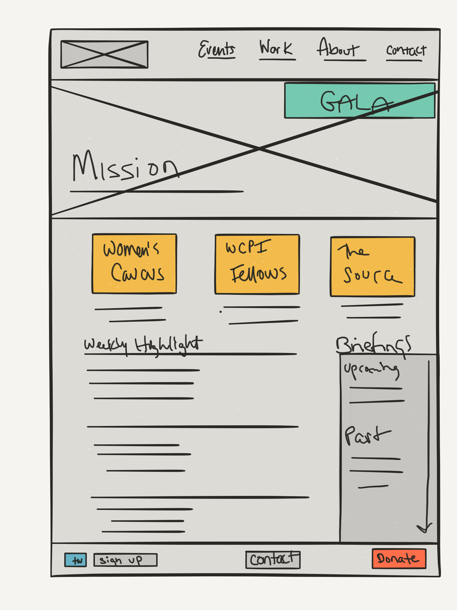
Mapping the Information Architecture
Mapping out the current site allowed me to see what information was important to the user journey, what could be cut, and where there were potential missed opportunities to support the user in reaching their end goal.
Super Lo-Fi Testing
I tested the wireframe with five users to understand how effectively users were able to find key events and understand the site. I also tested to see how users felt about the amount of information per page.
Findings:
Users found the fellowship section very important.
Users found the header copy a bit confusing.
Users were confused by the numerous, differing subscribe buttons.
Users wanted to see more information about the Women's Caucus.
Iterations:
I reworded the copy to specify "events" and "gala" as separate items.
I made only one subscribe button for all news, events, information.
I moved all of the information that is mandatory but not necessarily important to users (advisory committee, staff names) to one page.
Redesign Testing

ACTION
I had users open the existing website and give feedback. I tested to see if they would understand the organization's work and mission from browsing the site.
RESULT
80% users were able to decipher the organizations work and mission from browsing the site.
ACTION
I tested to see if users would be able to accomplish simple tasks, such as finding the Annual Gala information - their biggest event of the year.
RESULT
100% of users were able to find key information points within 3 clicks.
No users gave up trying to accomplish tasks.